If You Want to Live a Long and Healthy Life, Follow These Simple Tips
When it comes to health and longevity, there is no quick fix and no “fountain of youth” that will help you become healthy overnight. Being fit and healthy in order to reach a ripe old age takes effort and attention – this is something that I repeatedly tell my readers.
But here's the good news: there are a few simple lifestyle changes you can make to improve not only the quantity, but also the quality of your years. These changes are pretty basic, but can have a profound effect on your overall health once implemented.
A Healthy Diet Is Essential to Longevity
One of the most basic health principles (and, sadly, the one people most often ignore) is eating a diet of whole, nutritious foods rather than unhealthy processed foods. Keep in mind that processed and junk foods are loaded with grains, sugar, and unhealthy calories that increase your insulin levels, which not only accelerates the aging process but also increases your risk of obesity and chronic disease.
I also highly advise against consuming genetically engineered (GE) foods. Not only are GE foods less nutritious than organically-grown foods, but they also pose many health risks. In fact, most processed foods today contain GE ingredients – regardless of the fact that these GE components have not undergone long-term safety studies.
The best diet I would recommend for optimal health and longevity is one that's focused on whole, unprocessed foods – preferably organic vegetables, grass-fed meats, raw dairy, and nuts – acquired from healthy, sustainable, local sources. I also recommend consuming a good portion of your food raw, as well as adding naturally fermented foods to meals.
By implementing these basic diet changes, you can make a big leap toward longevity and optimal health.
For more useful tips in healthy eating, I advise you to follow the Mercola Nutrition Plan, which will guide you in choosing the right foods that will suit your unique biological makeup. The Mercola Nutrition Plan addresses your unique biochemical needs based on your specific genetics, allowing you to cure your health problems at the foundational level and giving you a more permanent solution for regaining your health.
Another Risk Factor of Early Death: Living a Sedentary Lifestyle
Equally important to consuming a healthy diet is being physically active. According to studies, people who are sedentary are found to have a shorter lifespan. In fact, one study shows that reducing the average time you spend sitting down to less than three hours a day may increase your life expectancy by two years, and reducing the time you spend watching TV to less than two hours a day could increase it by 1.4 years.
I understand how difficult it is to avoid sitting down for prolonged periods, as computer work is very predominant today. Even I am guilty of spending a significant portion of my day sitting down. But to make up for it, I make sure that I get enough exercise daily. I also take frequent breaks every hour to stand up at my desk. I highly recommend Foundation Exercises, developed by chiropractor Dr. Eric Goodman, as well as short-burst high-intensity exercises, like Peak Fitness. You can read more about these techniques by subscribing to the Mercola daily newsletter.
Exercise also has some anti-aging effects, as proven by many studies. One study published in the American Journal of Physiology says that exercise triggers mitochondrial biogenesis, a decline of which is common in aging. This means that exercise can reverse significant age-associated declines in mitochondrial mass and, in effect, stop aging in its tracks.
Basic Guidelines for Optimal Health and Longevity: Try Them Today!
Keep in mind that modifying your diet and exercising are not the only important factors of health and longevity. There are many other things that you need to implement to ensure that you will be optimally healthy.
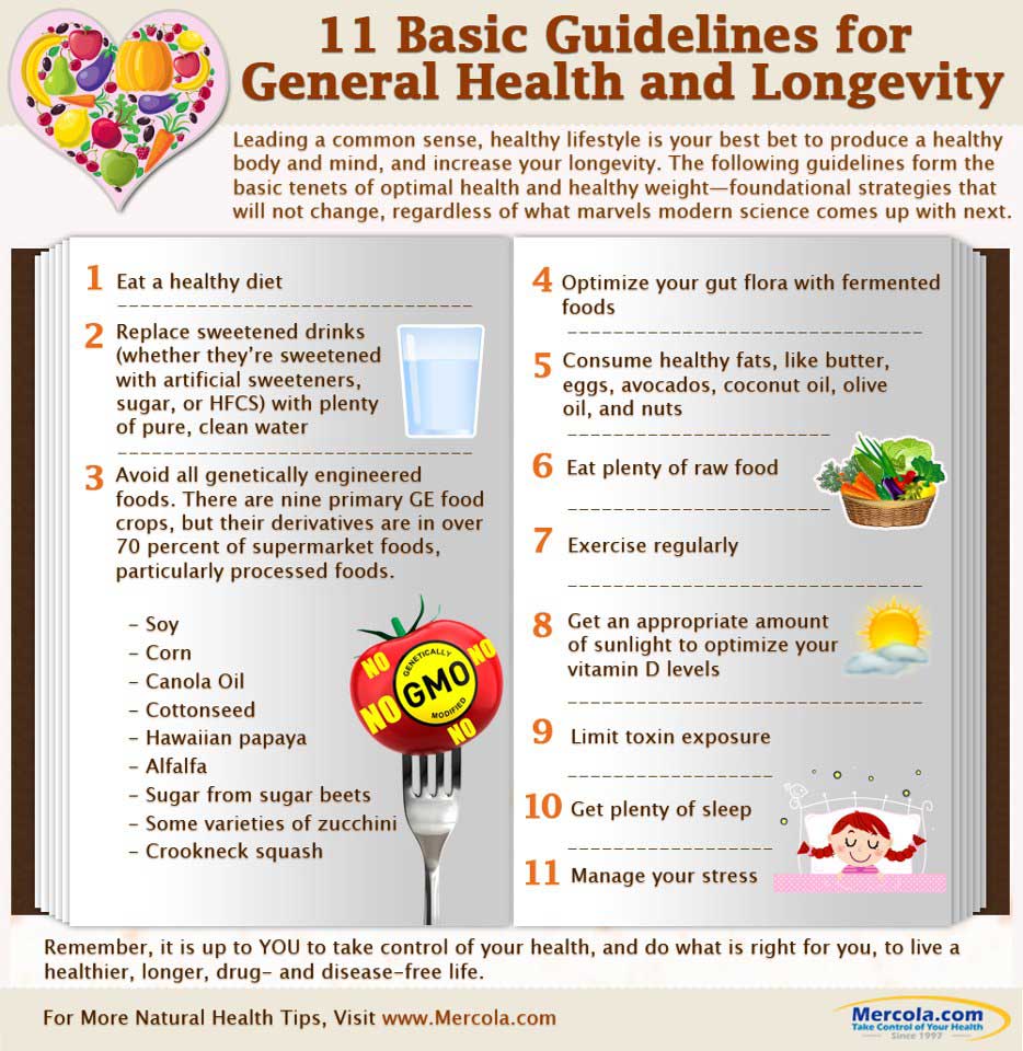
I have created this infographic, “11 Basic Guidelines for General Health and Longevity,” to summarize all the components that need to be addressed if you want to live a long and healthy life. Here, you will learn:
- Timeless tips that will help improve your quality of health
- Healthy anti-aging foods that you can add to your diet
- GE crops, found mostly in processed foods, that contribute most to disease and early aging
- Why getting enough sun exposure is essential for optimal wellbeing
These guidelines form the basic tenets of optimal health. They are tried-and-tested foundational strategies that will not change, no matter what improvements modern science comes up with.
I urge you to follow these tips to significantly decrease your likelihood of disease and premature aging. Use these as the foundation of your overall wellness plan, and you will surely succeed in improving your health.